UX-679 Filter on Saucony PLP redesign (mobile first)
Saucony, a primarily sneakers brand that is part of the Wolverine Worldwide portfolio of brands is looking to update the current filtering menu (July 2021) on the PLP ( Product Listing Page). The existing Filter Menu seems slightly dated and missing several UI elements that would improve the overall usability and engagement with the filtering feature.
Problem: Filter Menu on mobile is not interactive and intuitive enough for users to see what filters they are selecting as they search for the products they need.
Hypothesis: I believe that if we enhance the filtering functionality on PLP, then we will see and increase in PDP views, Add to Cart and OCR (Order Conversion Rate).
Preliminary Insights
• Currently ~30% of desktop users engage with filters.
• Currently ~10% of mobile users engage with filters.
• Those who engage with filters are 70% more likely to convert.
Challenge: Develop a more intuitive, visual and interactive filtering system that can be implemented using the current Salesforce platform.
Research: Filter Insights and Best Practices
As a way to get insight into what features the user will need the filters to have in order to perform well and find the product they are looking for faster, I started my research by using Baymard Institute platform.
• Always explain industry specific terms.
• Enable mobile users to search long lists of Filters & Sort alphabetically.
• Ensure paths to Filtering & Sorting are abundantly obvious.
• Show the number of matches for each filter option and update them as filters are selected.
• Consider a horizontal Filtering & Sorting tool.
• On MOBILE, provide a clear ‘Apply’ CTA button.
Competitive Analysis
In order to understand the current state of the industry with regards to how brands approach Filtering & Sorting on mobile, I focused on studying five main competitor brand that the corporations usually keeps in sight.
The main features that I saw on the competitors sites and I wanted to include on the first prototype were the following:
With research and competitive analysis sort of completed for phase 1, I wanted to generate some insights by merging the findings..
Design
Before starting to design the Key Screens based on my Baymard Institute research and competitors analysis, I had to take into consideration and include some important Saucony brand requests:
• Place Color Filter at the top and the filter be open by default.
• Move Width Filter above Size Filter within Size & Width tab.
• Use high contrast Black/White color scheme.
• Increase the size of size buttons.
• Include a Filter icon.
• Do not show number of products within each filter.
• Sort By functionality should follow what’s currently on the the PLP and cannot be included on Filter Menu screen.
Feature Map w/ all filters needed for Men’s Running
Early Wireframes
In order to start designing, I selected a few existing screen from previous assignments that I had added recently to the Design System. These reflect an approximate design of the filtering feature on mobile that was live on the sites at the start of the assignment.


Key Screens and First Prototype

Design Review:
After reviewing first prototype w/ Fed team and CX team at large, the following feedback and considerations had to be implemented:
• Full width screen not compatible w/ Salesforce platform and will have to revert to regular slider Filter menu.
• CTA buttons cannot exist inside regular overlay slider menu.
• Technology features cannot be expanded within overlay slider menu.
NEXT…
Updated design featuring new slider sheet Filter Menu

Main updates:
• Filter Menu is now a Slider side sheet.
• ‘Filters Applied’ tab gets updated with the number of filters selected at start of text line.
• Each filter tab gets updated with the number of filters in use within each tab. This number is displayed in between brackets at end of text line.
•Number of filtered products show at top center of Filter Menu i/o Filter tab.
Design Review & Feedback:
At this stage, there was a new request coming from the brand that included moving some of the filters out to the tabs and create a new ‘Categories’ filter that would help define the search according to more specific needs, depending on what type of shoe category the shopper started with. For example, as the shopper is looking for running shoes, some of the filters that were hidden within the tabs, such as ‘Trail’, ‘Neutral’ or ‘Racing’ will now appear within a new filter tab (Categories) and be places at the top of filters menu. These categories will vary depending on the type of shoe the shopper is looking for…
• Create a new ‘Categories’ filter.
• Redesign filter labels as they seem too overpowering within the slider.
• Might decide to move Size & Width filter above color filter but ok as is for now.
Updated design featuring new slider sheet Filter Menu


Review & lessons learned:
At this stage, the new Filter Menu design was somehow completed and ready for the next stage, testing. It was decided that this new feature should be developed by outside vendor based in India (Brillio) and go into queue for early 2022 and there will be more requests and reviews coming in order to make this feature the best it can be while staying within budget.
I learned that some of the features that I wanted to implement could not be supported by the current platform and therefore some of my research could not be applied, and many compromises had to be made. Nevertheless, the process of seeing the project developed, and seeing the new Filtering tool being built, as well as collaborating with the different teams involved made the design journey a really satisfying one for me.
In addition, as multiple brands in the organization will be using this tool with slightly different variations to accommodate their specific needs, I see this project as a stepping stone that will uncover further needs by each brand and therefore the Filtering tool will keep evolving.
Finally, I believed that the product we’ve arrived at as a team is a much better, user-centered and intuitive Filtering tool than what we had previously in place and I’m really looking forward to see it live!
UX2-604 Homepage Best Sellers Above the Fold (Saucony).
We believe that moving Best Sellers category above the fold will help customers explore category faster and increase conversion rate. However, Brand prefers to keep editorial/hero story as the main focus on Homepage. Testing will provide data and influence future decisions when hoping to reach a balance between creative integrity and conversion.
Problem: Customers cannot see and explore the ‘Shop by Category’ feature until way down the Homepage, while data provided shows that selecting a category is the preferred method to get to the desired product category.


Methodology: A/B testing
Control (A): will be current HP layout with hero/editorial story as the main content ‘above the fold’.
Variation (B): will have Best Sellers carousel as the first content available below navbar and banner.
STATUS: Pending (Test in queue for 2022).
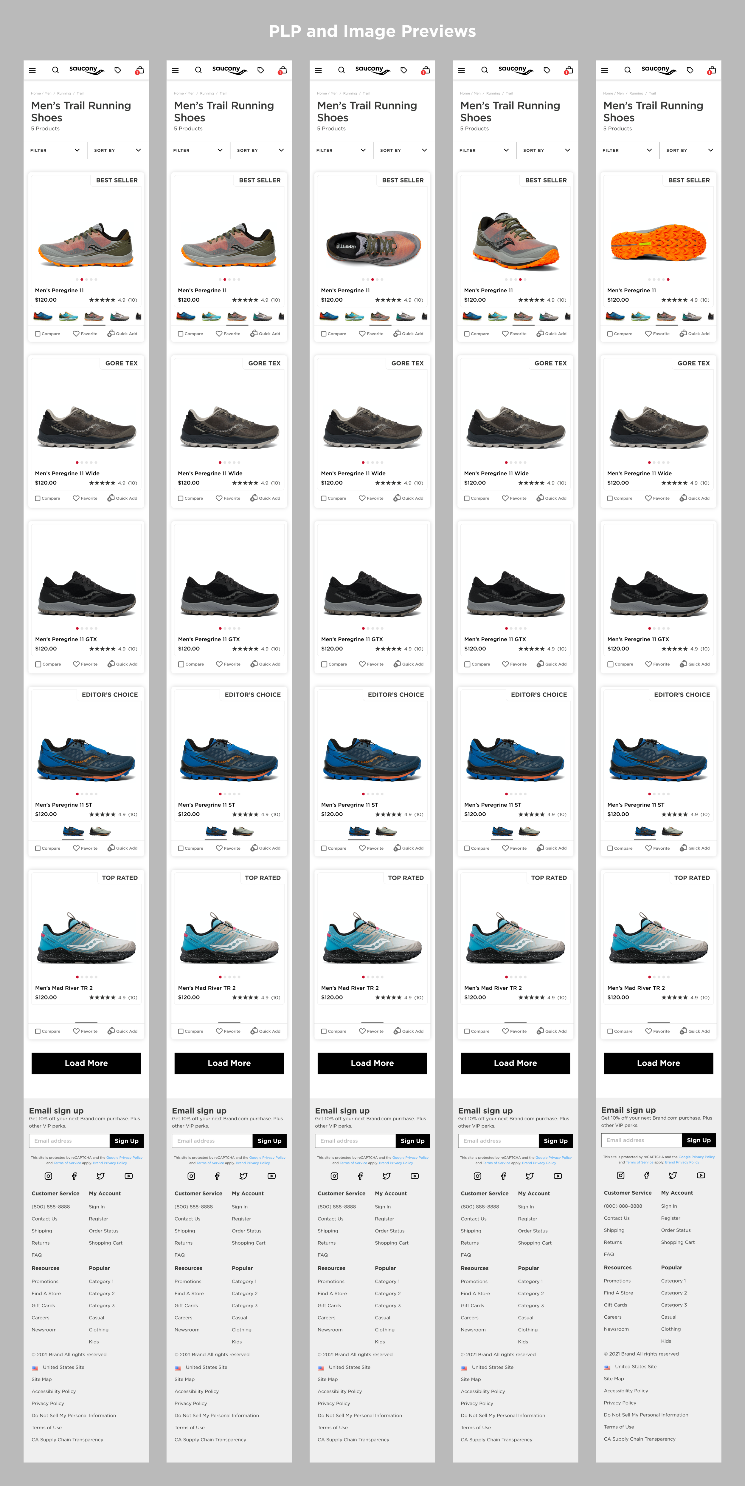
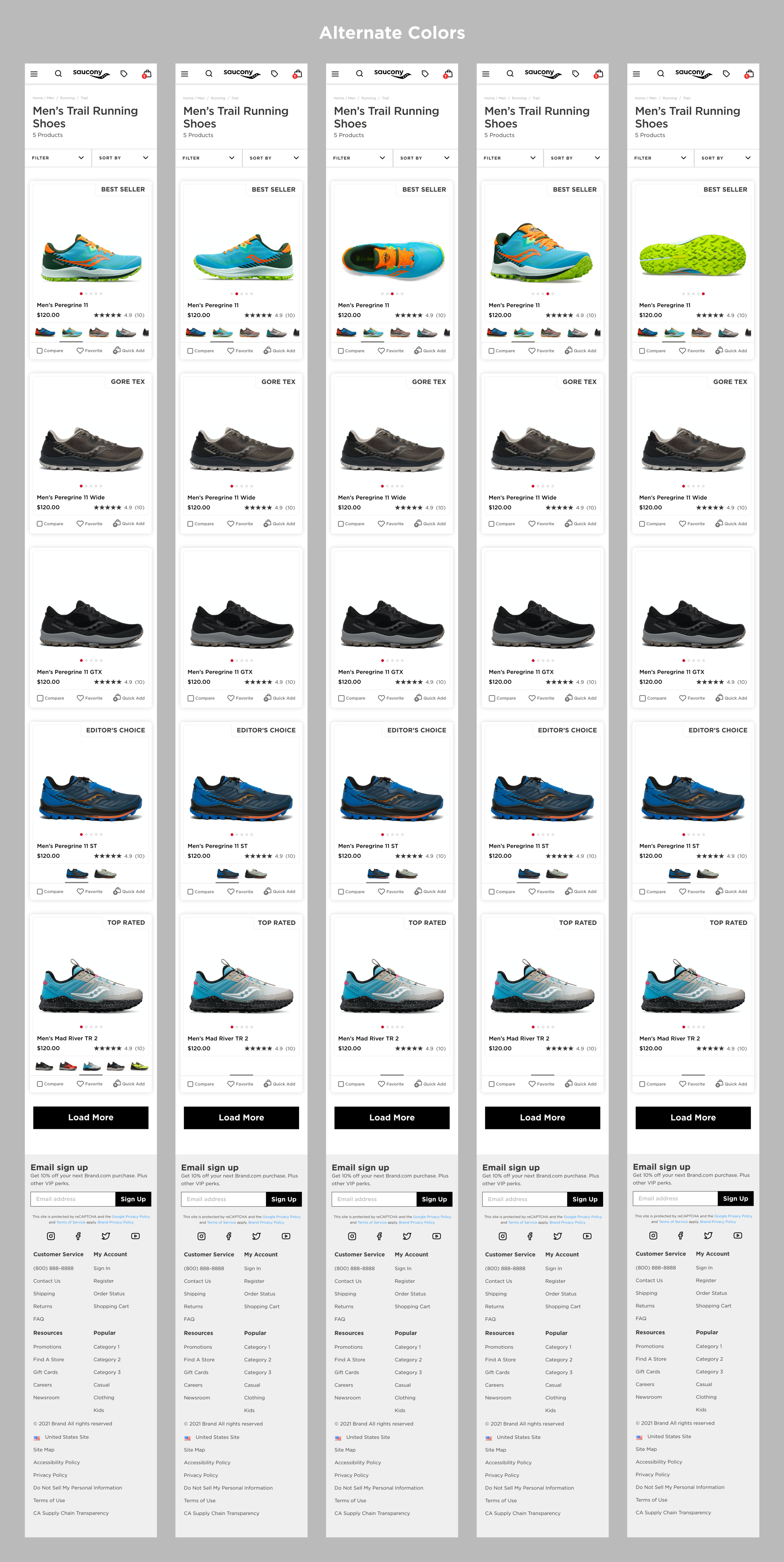
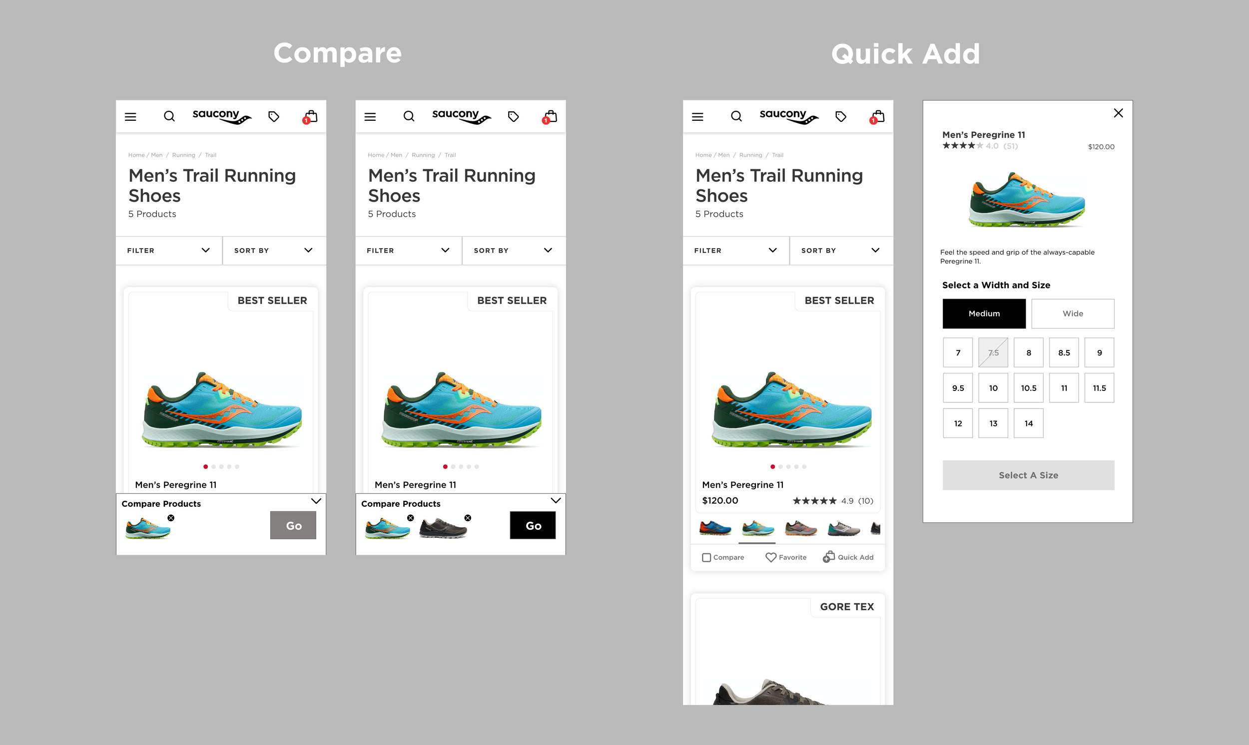
UX2-492 New Product Card Prototype
I believe that updating the product cards on PLP to show expanded information such as Quickview, Color thumbnails, and compare upon hover instead of expanded by default will allow for users to take full advantage of all relevant product tools and information, while still keeping the PLPs scannable and clean.

Design Review:
The objective is to focus on new card layout and how to use updated tool such as Compare and Quick Add.